Veritas
Cybersecurity
Branding, Motion, UI
01. Overview
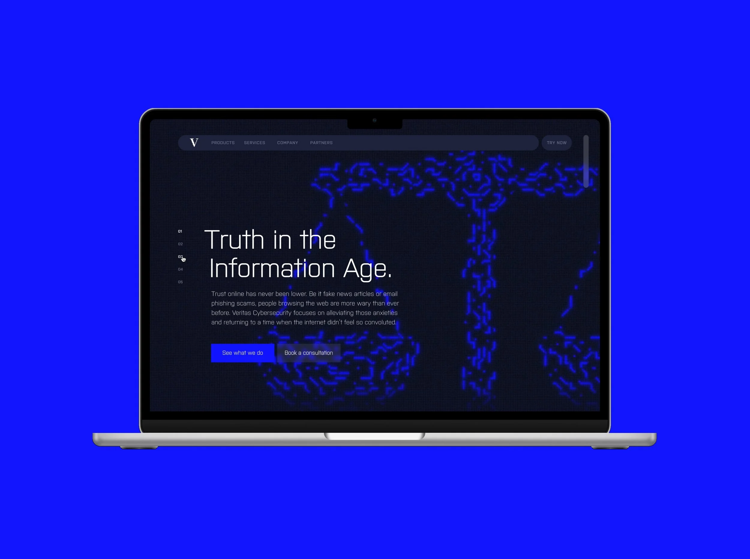
Trust online has never been lower. Be it polarizing news outlets or email phishing scams, people browsing the web are more wary than ever before. Veritas Cybersecurity focuses on alleviating those anxieties and making the internet feel less convoluted. With fact checking browser extensions, network security monitoring and a host of encryption tools, Veritas ensures online honesty and safety.
—
02. Softwares
Figma, After Effects, Photoshop, InDesign, Illustrator
—
03. Team
Jeremy Kocher, Nick Waldinger
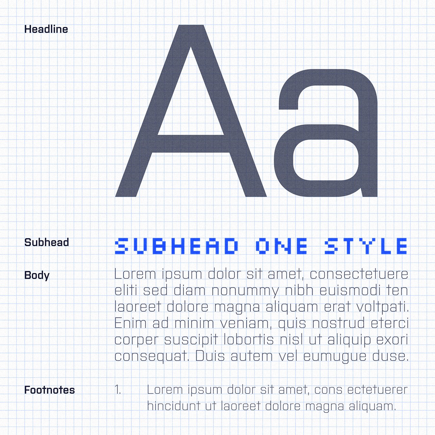
Logo System
Built on a 54-pixel grid, the logo mark immediately identifies Veritas’ digital nature.
This mark is coupled with two typefaces: Purista, the primary brand typeface, and Silkscreen, a secondary typeface that supports the brand identity where larger devices are unavailable. The grid also allows for alternate logo marks to be made for future Veritas subsidiaries.


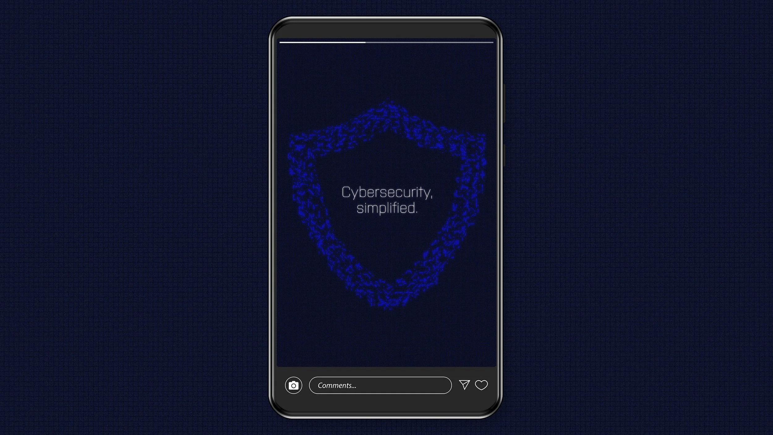
Website Prototype
Websites are one of the most common ways consumers interact with brands.
Now more than ever, companies are expected to have websites that are informative and easy to use. So when designing Veritas’s website, the user interface was kept front and center. Animations and illustrations reinforce the brand identity, but not at the expense of the website’s usability.
The prototype includes a homepage, a rundown of the company’s history, a list of services, and a product page.
Made with Figma.
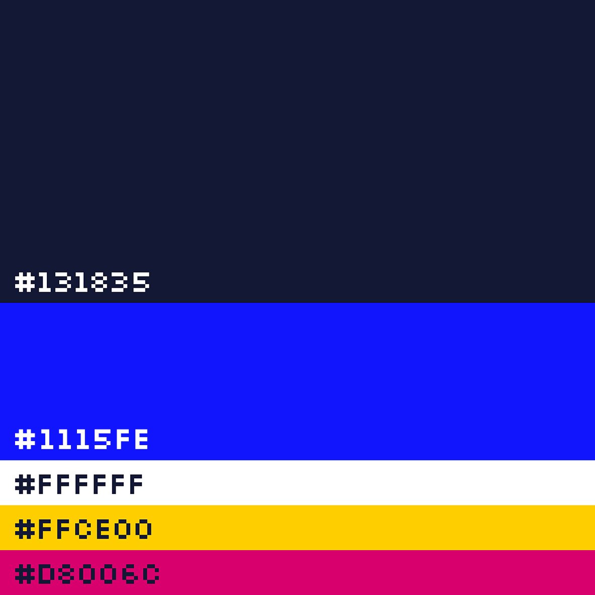
Brand Assets
Presentations represent a brand on a day-to-day basis.
But most employees aren’t designers, and these employees are usually responsible for creating said presentations. So if steps aren’t taken to ensure brand continuity, employees may start breaking rules they didn’t even know existed.
One of these steps includes creating asset templates for presentations, such as tables and charts. Outward facing presentations for conferences or webinars are typically more planned out and polished, making the use of different effects and animation more appropriate. Internal team presentations, however, would have a more stripped down approach.


